
Chart Module
The History Charts Display module is a highly customizable charting module which aggregates history counters. Examples of chartable events include sync operations, like adds, updates, deletes, and errors, attribute changes, workflow and health check operations, password resets, etc.
Chart Interactivity
Each datapoint on a chart is hover-able and clickable. Hovering over a point displays the name of the data series, the exact count, and the time span the count aggregates across. Clicking on a datapoint will open the History panel in a new tab. The History panel will be pre-filtered to the exact run history records that were aggregated to produce the chart datapoint.
The chart module does not auto-refresh it's results. To update the chart you must refresh the page.
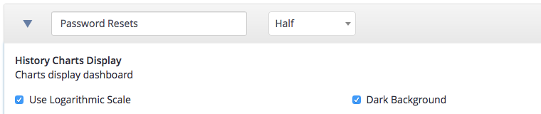
General
Charts must have a name. The full vs. half width choice will depend on number of intended datapoint in the time range.
Charts may be displayed with a logarithmic Y scale instead of linear, and they may be displayed light on dark instead of dark on light.
Filtering
Use the filtering options to select the history records to aggregate in your chart. The Provider, History Type, Argument, and Result filters offer the same options as History display, which lets you preview the types of results which will be included.

Time Range
The time range gives the interval per data point, and the overall range of the chart.
The Interval, From, and To times all include both a quantity and a unit.
You may leave the interval blank and one will be calculated which is appropriate for the time range.
The From and To times are calculated as an offset from the present. If the From time is more than a week in the past, the time will be rounded to the beginning of the day.
If you leave the To field blank, the current time will be used.

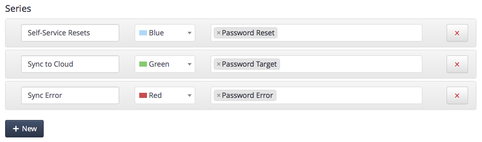
Series The data series choice should have one entry for each line on the chart. The data series must be given a name and a color, and should have one or more chart counters selected. If you put multiple counters in one line, they will be summed together.
Additional Notes
Due to the range of possible options, creating a useful chart requires some thought. Here are some additional considerations:
- If the chart is intended to show trend data the time range must show enough history to be meaningful, and the aggregation interval must be large enough to smooth out the spikes from your schedule interval (typically at least a day). If the time interval is less than 24 hours and covers more than a week or two, the chart is usually too jagged to be helpful. Shorter intervals can still be helpful, but typically only for charts that show the most recent couple days, and are intended to reveal sudden spikes in change counts.
- Counters should be selected so that different data-series in the same chart have appropriate magnitudes. For example, if your environment typically has several hundred updates per day, and only few couple errors, then if both updates and errors are placed in the same chart, the error series will just look like a flat line at the bottom.
- In most cases relative dates will be more useful than absolute dates for charts. An absolute dates chart may be created as a reference, e.g. to compare change counts in different months or quarters.
- The distinction between Full and Half size charts disappears on many mobile devices. Below a certain screen or browser size all charts are displayed full-width.
- When using relative time offsets, the browser calculates the offset relative to the current time (e.g. 3 weeks ago at 2:31:05 PM). On the server, if the offset is more than a week in the past, the server will justify the timestamp to 12:00 AM local time.
Comments
0 comments
Please sign in to leave a comment.