
Service Panel uses a Material Design library, laid on top of the bootstrap UI framework. The colors, logo, and icons used within Service Panel are customizable. The overall layout and input look and feel is inherited from the design framework.
Advanced customization is possible, but requires modifications to layout templates and stylesheets. For most scenarios the built-in theme customization is sufficient.
Theme Editor
Navigate to Settings -> Service Panel -> Theme to configure the look and feel of Service Panel.
If this is the first time configuring service panel, immediately press the "Save" button to initialize Service Panel Settings. If this step is skipped, an error will occur when the logo is uploaded.
Click Upload Logo to choose a custom logo for Service Panel.
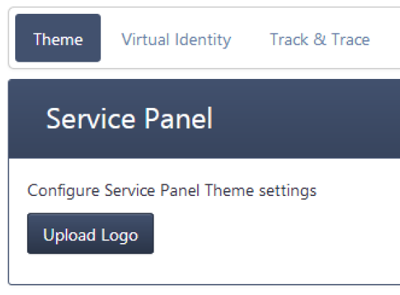
The chosen logo file may be a .PNG, .GIF, or .JPG format, and must be no more than 100KB in size. When viewed on service panel the logo will be displayed 52px high, and up to 250px wide. The recommended logo size is a minimum of 104px in height, and proportional width to allow for proper appearance on high resolution displays.
Service Panel also allows eight theme colors to be customized. These colors control things like the main layout colors, loading and other icons, and info and alert messages.
It is not necessary to override all colors. For example, you may choose to override just the primary color and leave all others as default.
To override a color, press the "+ New" button under Theme Colors. Choose from the dropdown which color is being specified, then enter the hexadecimal value (including hashmark).
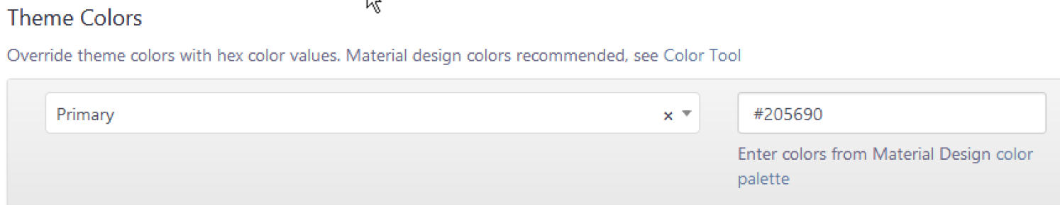
The available colors are:
- Primary – The main color used for menu bars, link, icons, etc. (default blue)
- Secondary – Alternate color used for loader bars and other smaller UI elements. (default yellow)
- Accent – Accent color for input elements (default bright yellow)
- Error – Color for error alerts, messages, and validation errors (default red)
- Info – Color for informational alerts and messages (default blue)
- Success – Color for success alerts and messages (default green)
- Warning – Color for warning alerts and messages (default orange)
- Hyperlink – Customize the color of hyperlinks. Default is for hyperlinks to match the primary color. If using a lighter primary color set the hyperlink color to make it darker
In addition to their use within the underlying design framework, all named theme colors may be used to customize the color of icons, text, and input elements on service forms.
For convenience, the theme help prompt includes a link to the Material Design color palette. It is not required that you choose colors from this palette, but it provides helpful guidelines for designing a theme. You may use the Material Theme editor to help ensure that the selected Primary/Secondary/Accent colors meet accessibility guidelines.
Other theme settings are:
Application Title: Control the name of the application that is added to the header. Default is "Service Panel". This field may also be set to an empty string if only a logo is desired.
Dark Theme: Optional checkbox to switch the theme to a light text on dark boxes mode. Choosing dark theme will require selecting lighter primary and secondary colors to obtain sufficient contrast.
Logo Target URL: Allows customizing the logo to redirect users to a page other than the Service Panel home page.
Logo CSS Margin: If the application logo content is not perfectly centered in the uploaded logo file, it may be necessary to adjust the logo margins to align the logo correctly with the title text. This field may have values for moving the logo by adjusting CSS margin: e.g. 2px 0 0 0 will move the logo down by two pixels.
Comments
0 comments
Please sign in to leave a comment.