
The text box form input is one of the most versatile and commonly used.
In addition to the common form input options, the text box input supports a broad range of controls around validation and styling.
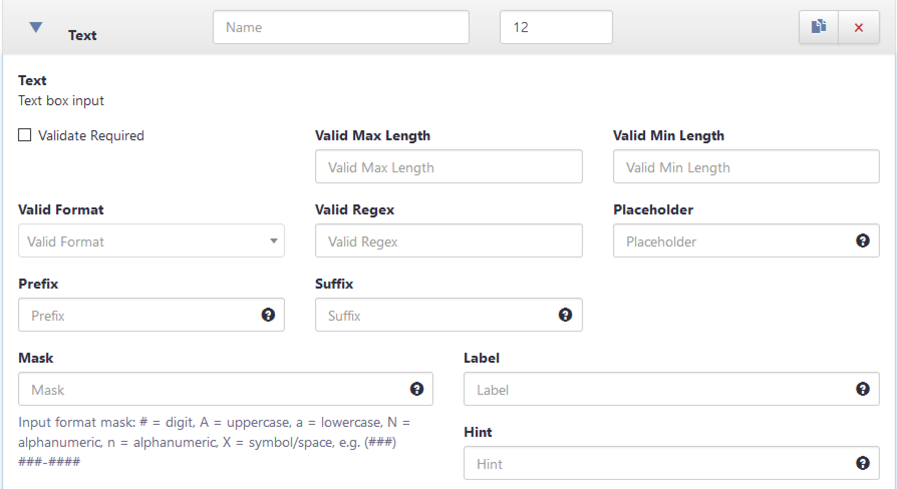
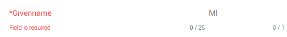
- Validate Required – indicates a value must be supplied
- Validate Max length – The text input length must be less than or equal to the supplied value. Displays in a a progress counter under the text box.
- Validate Min length – The text input length must be at least the supplied value. Displays in a progress counter under the text box. If the input is not required a zero-length is considered valid.
- Valid Format – selection list of common formats (Guid, Email, Integer, Decimal, Date, Time). The latter two are for use with API driven forms where a laxer format value is desired than that used by the Date and Time picker
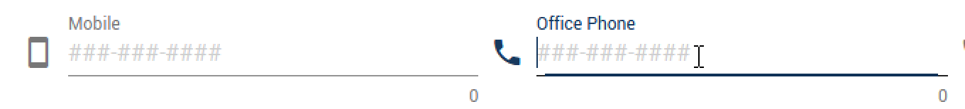
- Placeholder – Prompt text within the text box
- Prefix and Suffix – Text displayed immediately before or after the text box to cue users
- Mask – Create an input mask to more directly constrained live input of characters. NOTE: Only the masked characters are included in the value, so e.g. a masked input of (###) ###-#### will out a value of ##########
Comments
0 comments
Please sign in to leave a comment.